Quantify
Finance Web App
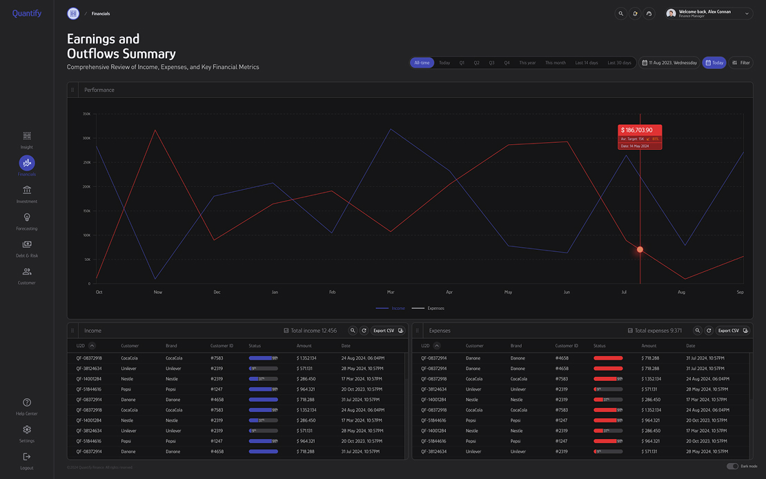
Quantify is a performance dashboard built for fintech teams to monitor, analyze, and interpret financial data in real time. The product translates high-volume transactional data into clear visual insights, supporting faster and more confident decision-making.
UX/UI Research and Design
Finance/Data Web App
MVP Product
Figma
React
SASS
JQuery
HTML5
Challange
The primary challenge was handling continuously changing financial data while keeping the experience clear and responsive. The dashboard needed to support real-time updates, scale with growing datasets, and remain easy to navigate across desktop and mobile devices. Making complex financial information understandable without oversimplifying it was a key focus.
approach
We designed a flexible dashboard architecture supported by a clear information hierarchy and modular components. Data visualization patterns were carefully selected to highlight trends, comparisons, and performance indicators. Wireframes and interaction flows were tested early to ensure accessibility, clarity, and efficiency across different usage scenarios.
Result
Quantify delivers a comprehensive fintech dashboard that enables users to track financial performance through real-time data and clean visualizations. Interactive charts and structured layouts allow complex datasets to be understood at a glance, while real-time updates support timely, data-informed decisions. The final experience balances analytical depth with usability, making financial performance both accessible and actionable.