İŞBİR Mattress
UX/UI E-Commerce Design
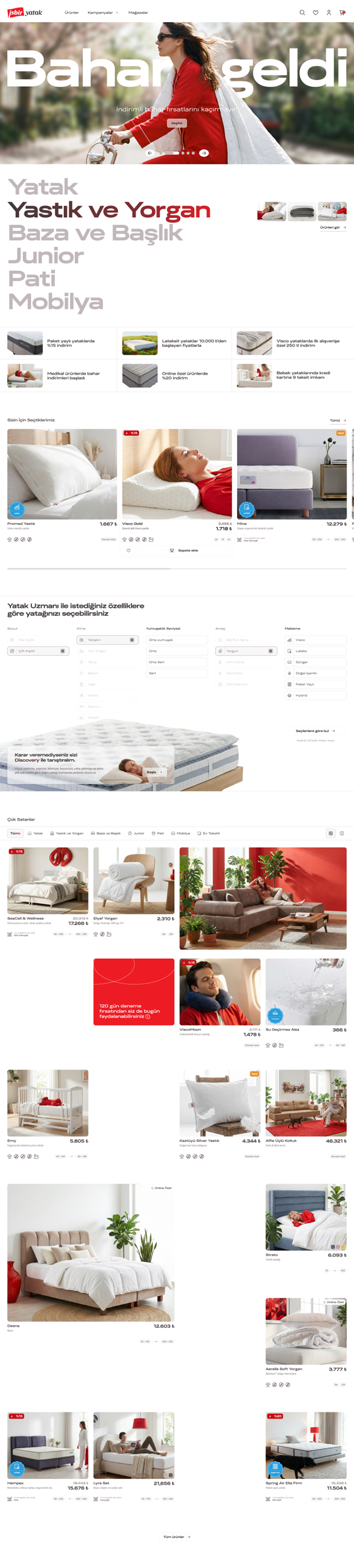
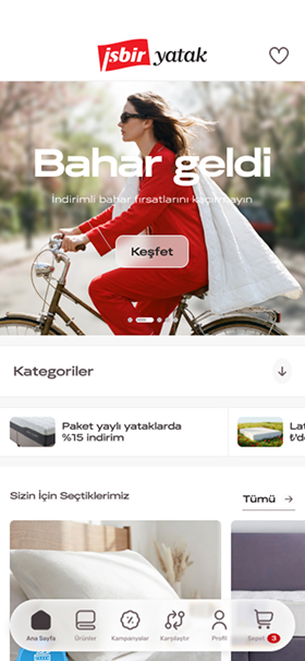
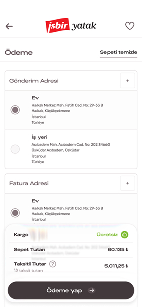
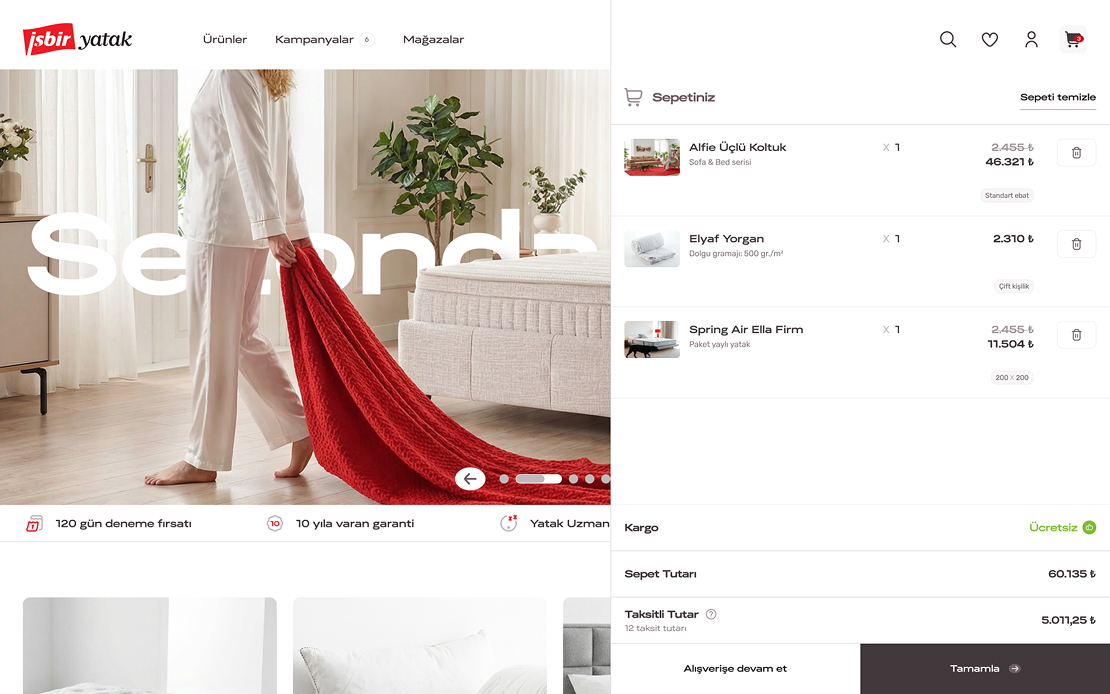
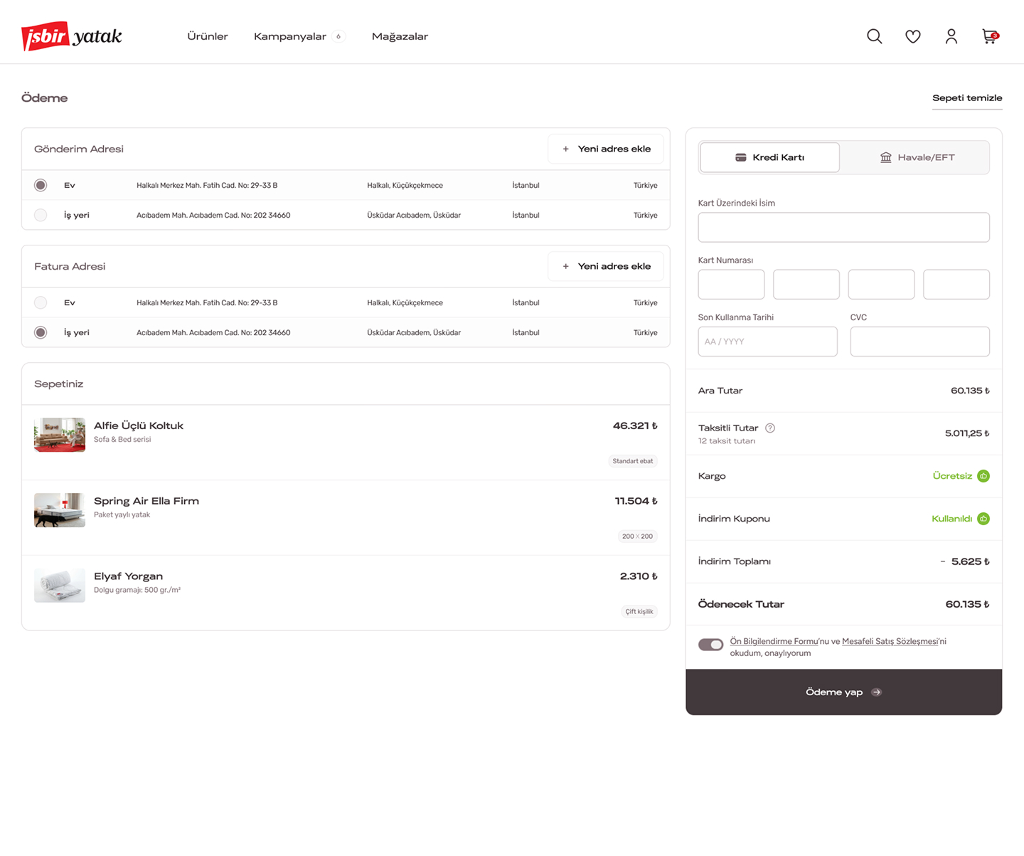
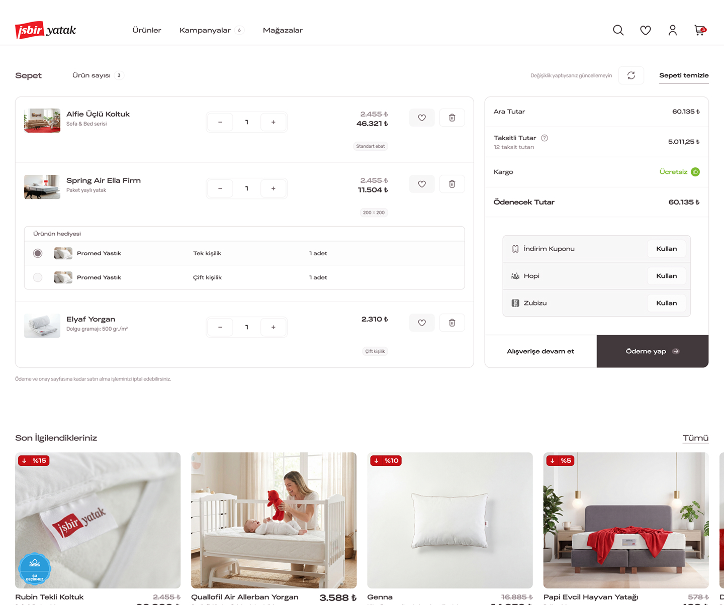
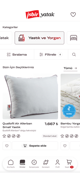
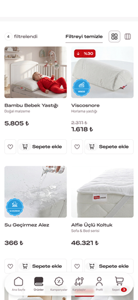
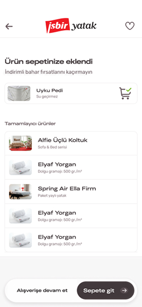
We led an end-to-end UX/UI design process for İşbir Yatak, one of Turkey’s established bedding and duvet brands. Translating the brand’s corporate identity into the digital channel while designing an intuitive, fluid shopping experience aligned with today’s user behaviours was the central focus of the project.
E-Commerce
UX/UI Research and Design
Design System
Figma
Adobe
Gemini
Challange
The dominant red that defines İşbir Yatak’s brand identity required careful balance in an e-commerce context. An assertive brand colour, when applied without restraint, can place users under pressure and disrupt the shopping flow. The solution needed to represent the brand clearly while delivering a clean, trustworthy experience — one that guides without overwhelming.
approach
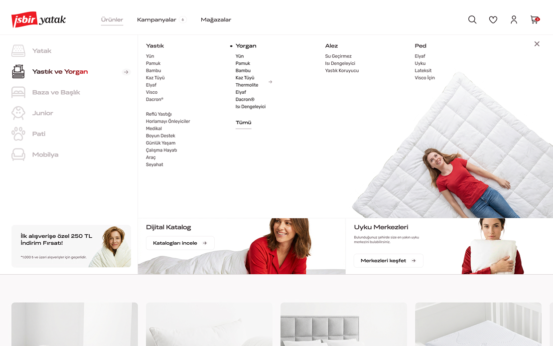
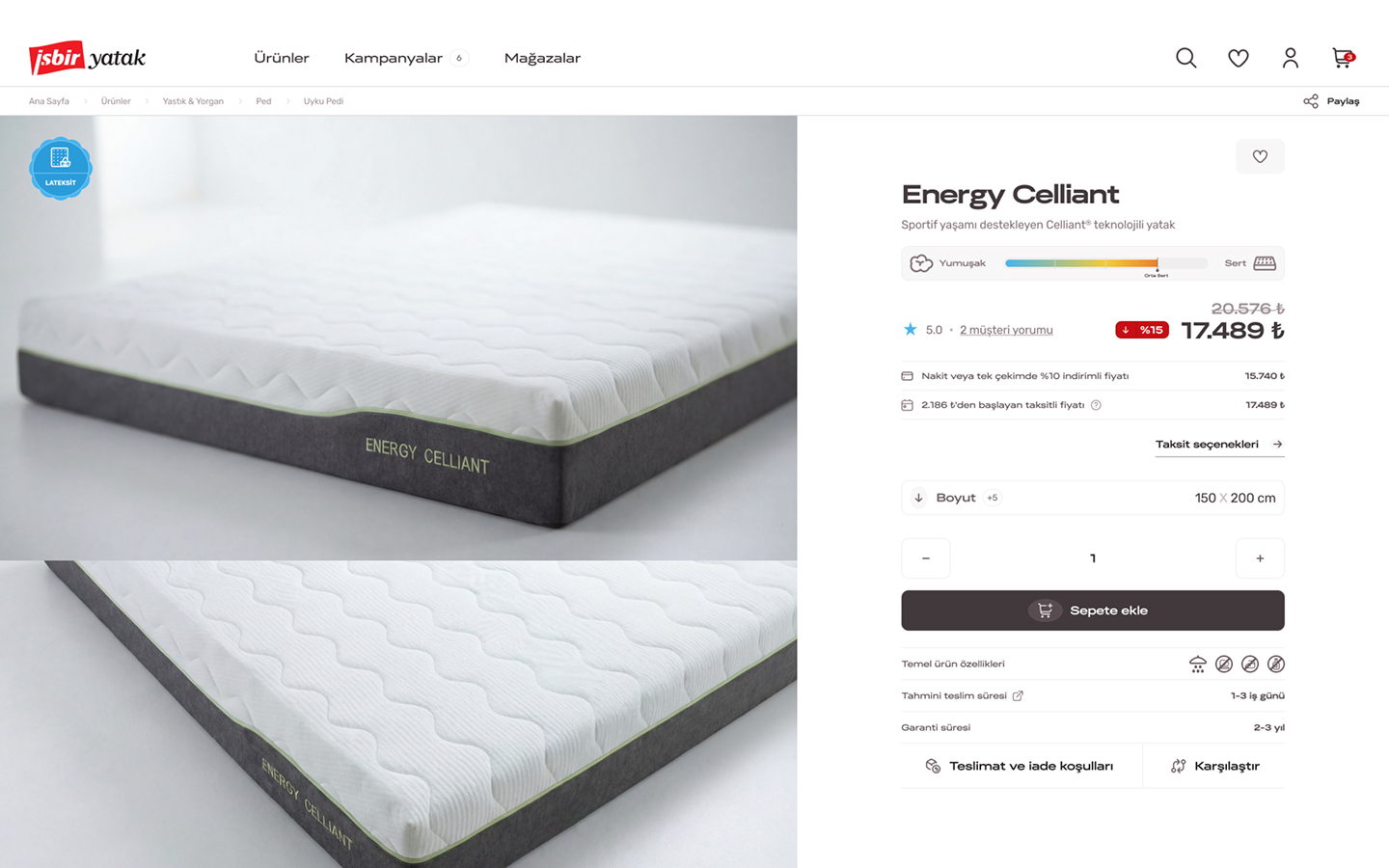
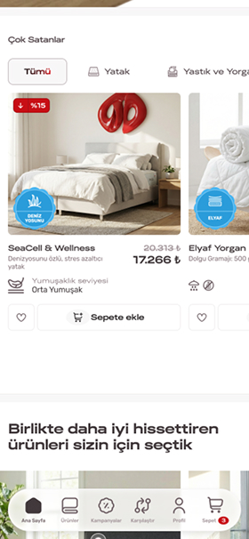
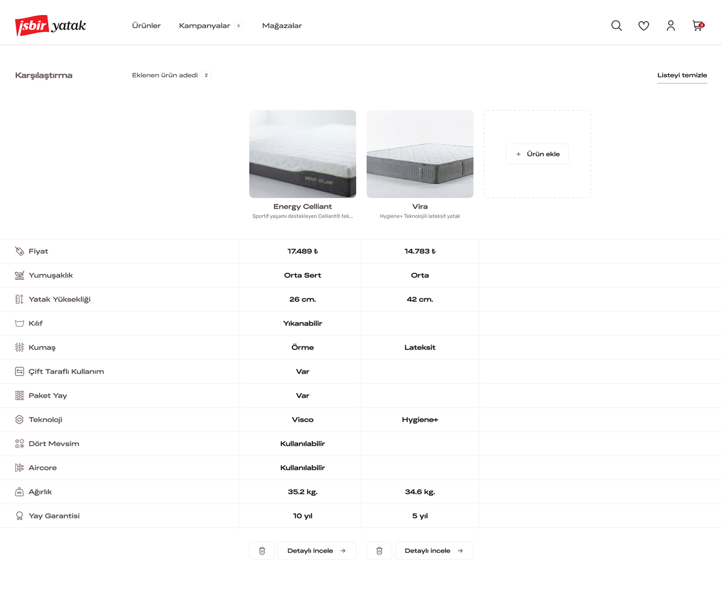
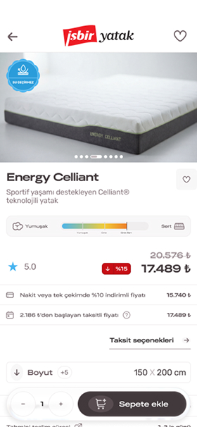
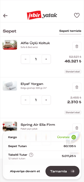
We began the design process with user flow and information architecture work. Rather than treating red as a dominant surface colour, we positioned it as a strategic accent — clarifying hierarchy, directing action, and reinforcing brand recognition without crowding the interface. Alongside a clean page structure and clear content hierarchy, we integrated curiosity and discovery elements into the flow to carry users naturally toward the next step. Each screen was structured to make the journey from product exploration to purchase decision seamless and unforced.
Result
The resulting design became an e-commerce interface that brings İşbir Yatak’s brand strength into the digital channel — guiding users without overwhelming them and making the shopping experience feel simple yet considered. The balance in colour application, the curiosity-driven moments within the flow, and the clean overall structure work together to create a consistent experience that brings users closer to both the brand and their purchase decision.