TUBITAK
IChO 2020 Website
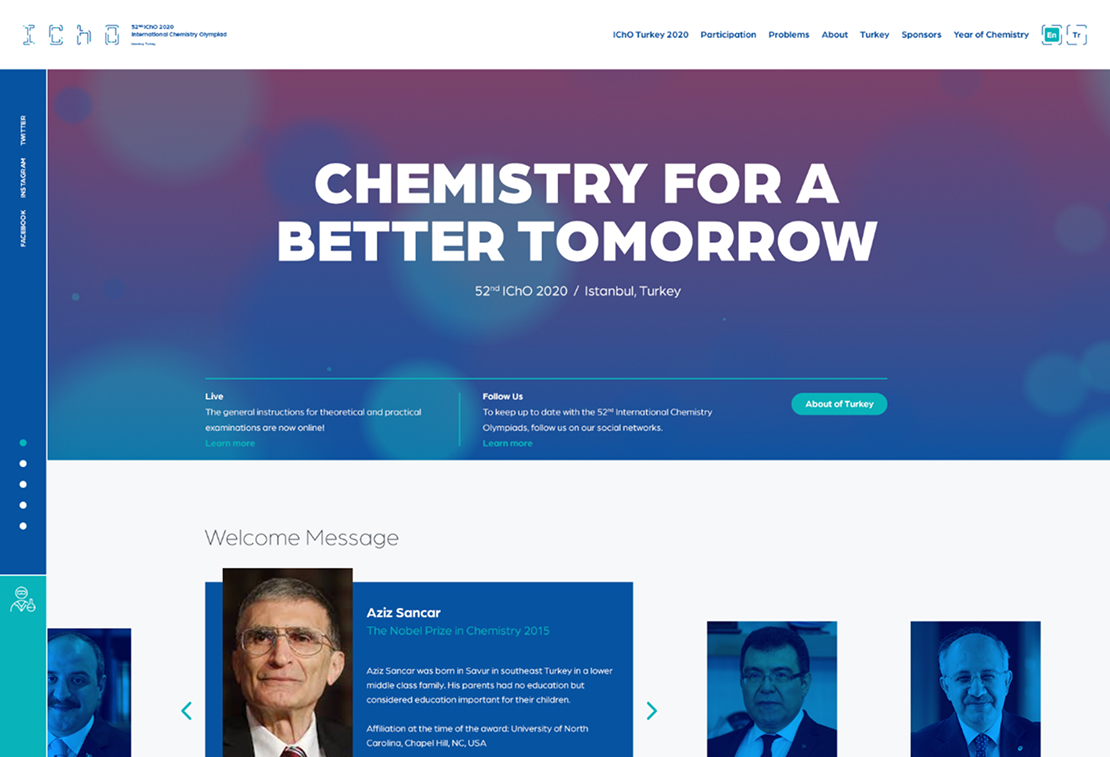
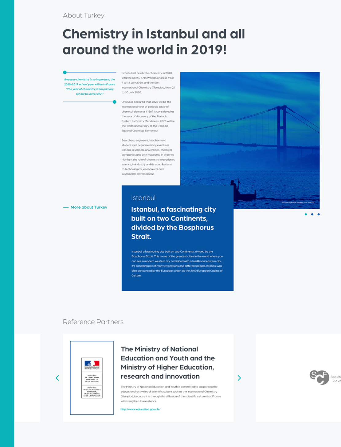
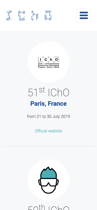
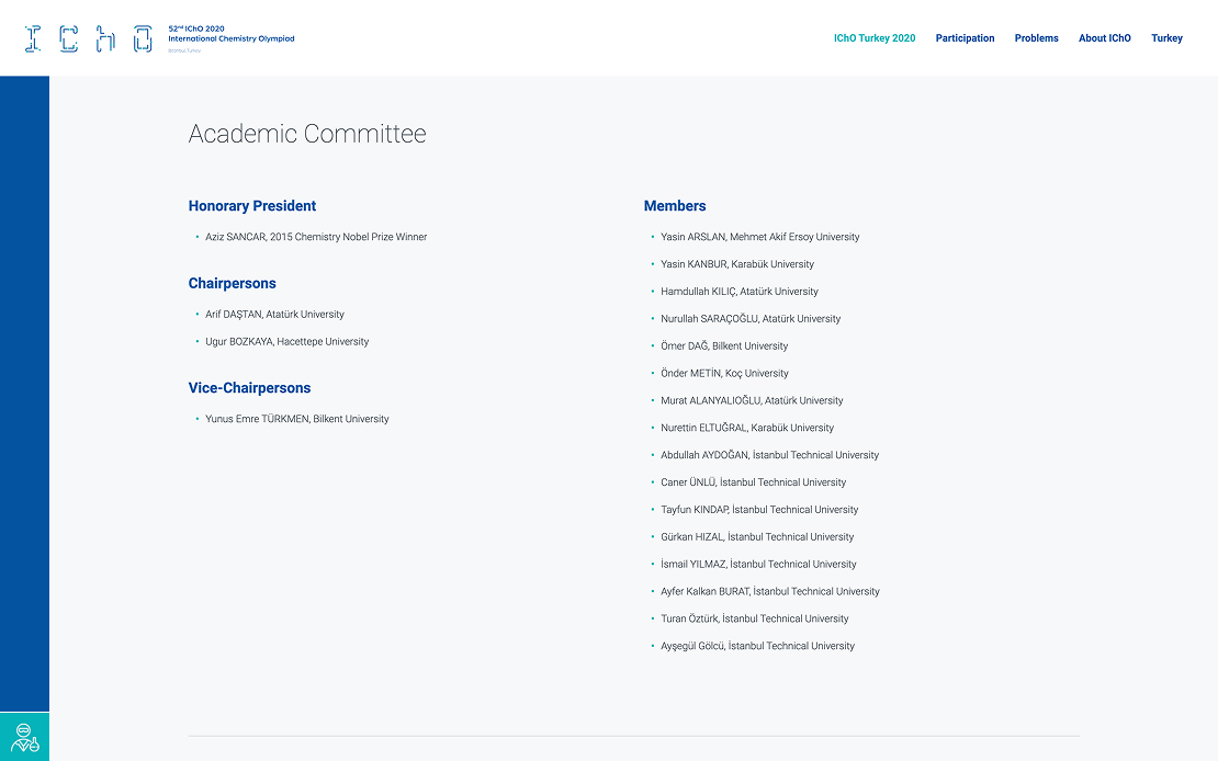
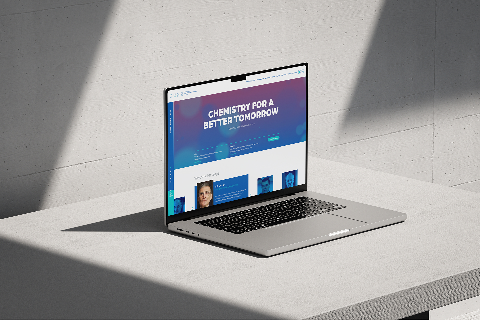
For the 2020 International Chemistry Olympiad hosted in Türkiye in collaboration with TÜBİTAK, we designed and developed a comprehensive digital platform for participants from around the world. The project focused on delivering a clear, accessible, and culturally inclusive experience for mentors, competitors, families, and instructors.
UX/UI Research and Design
Custom Web Application
Adobe
Android
Apple iOS
Angular
Figma
Firebase
Google Analytics
Google Fonts
HTML5
JQuery
React
Typescript
Challange
The key challenge was creating a platform that could be easily navigated by users from different countries, cultures, and age groups. Information needed to be structured clearly, accessible across devices, and aligned with a strong institutional identity, while supporting fast access to event-related content.
approach
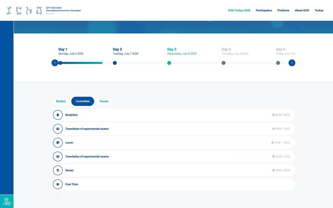
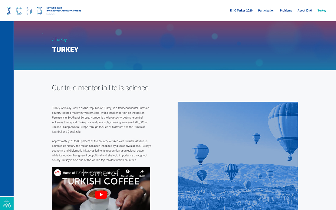
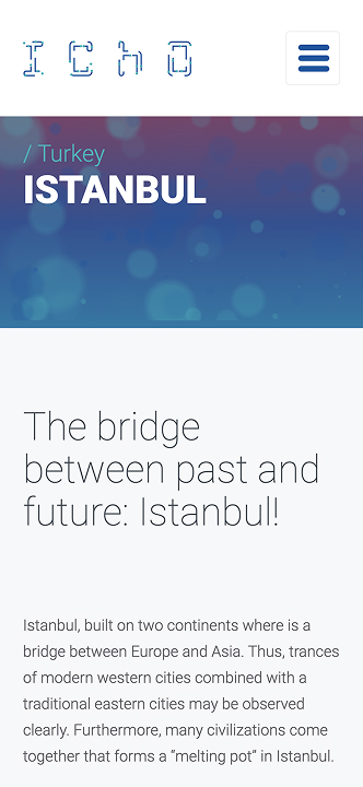
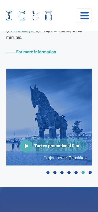
We designed an intuitive information architecture based on user habits, enabling participants to quickly find essential information about the Olympiad and its host country. UX/UI design was aligned with the corporate identity to ensure clarity and consistency.
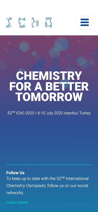
To enhance mobile accessibility, we implemented Progressive Web App (PWA) technology, delivering a fast and app-like experience across devices without compromising performance.
Result
The final platform served as a central, user-friendly information source for all IChO participants. With its clean UX/UI design and PWA-enabled infrastructure, users could easily access updates, schedules, and event details on both desktop and mobile devices, ensuring a smooth and inclusive digital experience throughout the Olympiad.